
Images form a big part of our website. This recipe will quickly run through how to configure image cache (different image presets for image ng) for different breakpoints using the breakpoint and responsive image modules. The recipe also details steps to create a quick responsive image gallery and a responsive banner slideshow.
How to do it...
1. Configuring ImageCache for breakpoints: The first step is to understand how the images vary with breakpoint in your site. This is to ensure that we do not load large images in smaller breakpoints
a. Add breakpoints to yourtheme.info file
breakpoints[mobile] = (min-width: 0px) breakpoints[narrow] = (min-width: 600px) breakpoints[wide] = (min-width: 960px)
b. Install and enable breakpoints module:
http://drupal.org/project/breakpoints. The prerequisite for this module is Ctools: http://drupal.org/project/ctools
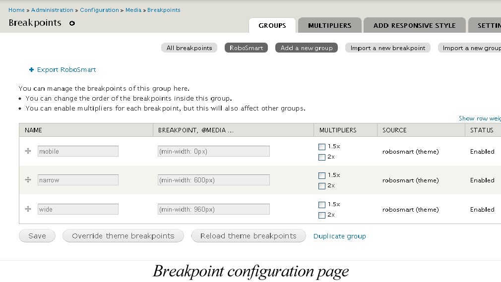
As we already defined the breakpoints in the info file, on installing the breakpoint module, we receive a message: The breakpoints from theme RoboSmartare imported and a new group is created.”
You can visit: admin/config/media/breakpoints/groups/robosmart to view the breakpoints. The 3 breakpoints defined become available.
c. Create Image styles
The breakpoint module provides an interface to automate image style creation for multiple breakpoints in one click, using the add responsive style configuration page available by clicking the “Add Responsive Style” tab at: admin/config/media/breakpoints/create_style. Edit the scale effect of each of the image styles to meet the requirements.
d. Install and Enable Responsive images and styles module at http://drupal.org/project/resp_img. The prerequisites for this module are: Breakpoints, Ctools (installed in step 1-a) & Field formatter settings API module: http://drupal.org/project/field_formatter_settings
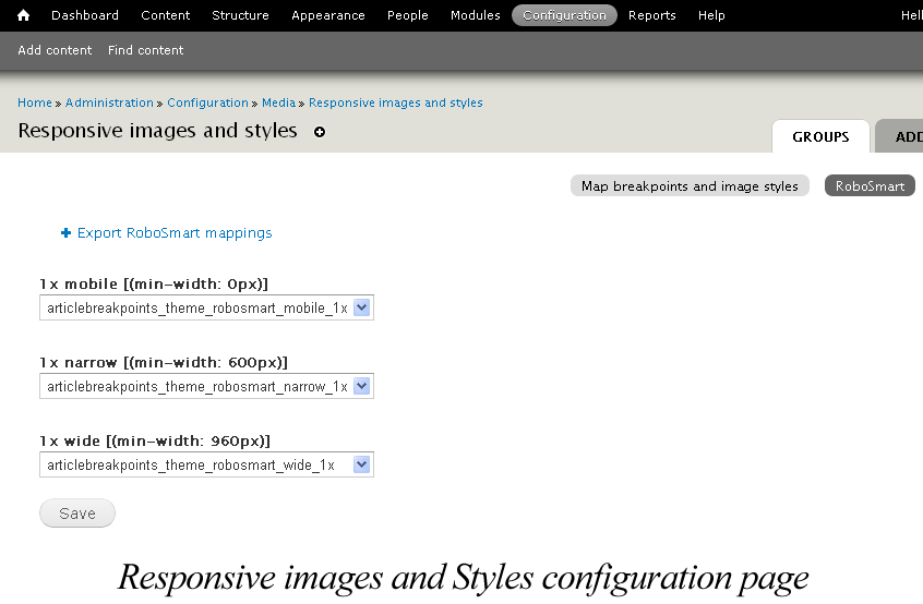
The Responsive images and styles module provides an interface to map existing image styles to breakpoints. Choose the group associated with the theme you are using and map the breakpoints to image styles at the configuration page “Responsive image and styles” : admin/config/media/resp_img
In our case choose the group robosmart, created while installing the breakpoint module in step 1-b. Map image style created in step 1-c to breakpoints. In our case, the image width, mapped to the different breakpoints are: Mobile: 284px, Narrow: 304px, Wide: 504px
e. Associate image styles to Content Types
i. Go to administer content types at the Administer Content types page:
admin/structure/types
ii. Click on manage display
iii. Click on the settings icon next to the image field you want to edit
iv. Associate image style to the group created for your theme
v. Save ...
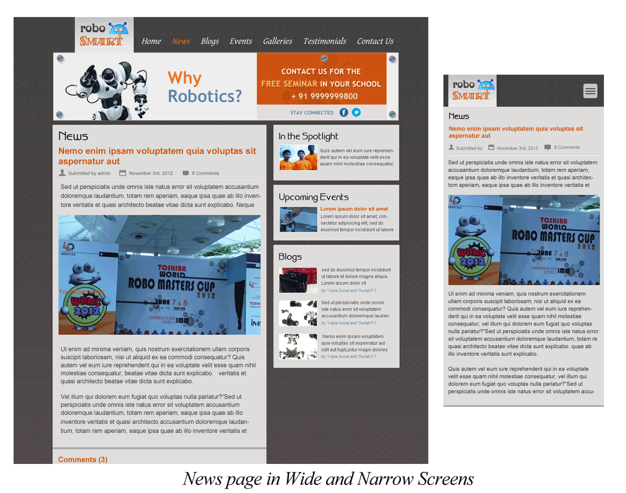
Visit a content page watch the images change with your breakpoints.
2. Creating a quick image gallery using gallery CCK and FlexiSlider module:
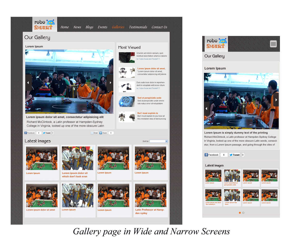
a. Understand the below design of the image gallery we are going to create. The top half of this page is the Gallery node.
b. To make the gallery node work like a slideshow, create a new content type Gallery. Add image field with unlimited file upload option enabled for this content type.
c. Install & Enable Flex slider module: http://drupal.org/project/flexslider Flexi slider has 4 sub modules. Enable Flex Slider and Flex Slider Fields modules.
The prerequisites for this module are: Libraries, Chaos tools, Image, File, Field, Field SQL storage. Please read the README file for installation instructions. Download plugins and move them to the library folder as instructed.
Visit admin/config/media/flexslider/edit/default to configure how you want your flex slider to work. Alternately create your own option set at admin/config/media/flexslider.
Associate image style to the group created for your theme.
d. Visit the Gallery content configuration page and click manage display tab. Select format as flex slider for the Image gallery field.
Click on the settings tab of the for the Image gallery field to configure the option set based on the options configured in step 2-c..
e. Click save to have the Flex slider enabled for the Image gallery field in Gallery content type.
3. Configure the inter-gallery navigation at the bottom of the page
a. Install & enable Views, Views UI and Views Fluid Grid modules:
http://drupal.org/project/views & http://drupal.org/project/views_fluid_grid
b. Configure a view that will display latest Gallery nodes. Set the display as fluid grid. Enable Block display.
c. Enable the Gallery block, set visibility only on Gallery node pages.
type) && ($node->type == 'image_gallery')) { return true; } ?>
4. To Build a Responsive banner add custom js file and include the below code. Load the js in page.tpl.php
$('#slider').flexslider({ directionNav: false, keyboardNav: false });
Create A banner HTML with attribute id="slider".
Voila! You have a responsive banner.
How it works...
The breakpoints module enables your theme to expose it’s breakpoints to other modules. It imports the breakpoints defined by your theme to create a new group for your theme.You could choose to use the same breakpoints or override/add more breakpoints as appropriate.
The Responsive images and styles module uses the information captured in the interface to map existing image styles to breakpoints to dynamically build html5 image rendering using picture tag & media queries. Inspect the section using firebug to understand the image rendering code generated. Below is a snippet from the code generated.
<a class="active" href="/news/article1"><picture alt="" class="resp-img-picture" title="">

<source alt="" class="resp-img-picture resp-img-picture-thumbnail--wide" height="378" media="(min-width: 960px) " src="http://unirobolabdev/sites/all/files/styles/thumbnail_wide/public/field/image/weather-9-1600.jpg" typeof="foaf:Image" width="504" /> …

<noscript><img class="resp-img-picture resp-img-picture-thumbnail--wide" typeof="foaf:Image" src="http://unirobolabdev/sites/all/files/styles/thumbnail_wide/public/field/image/weather-9-1600.jpg" width="504" height="378" alt="" /></noscript>

<img alt="" class="resp-img-picture resp-img-picture-thumbnail--wide" height="378" src="http://unirobolabdev/sites/all/files/styles/thumbnail_wide/public/field/image/weather-9-1600.jpg" width="504" />
The Responsive image module also allows us to introduce breakpoints based on Retina display. Configure breakpoints for different Retina displays and load appropriate images. You could also add Retina display properties to existing breakpoints.
The Flexi Slider uses jQuery Cycle plugin that provides slideshow effect and different transitions.


